The role of colors in marketing and branding has been a topic of interest for many years, and color plays a crucial role in influencing consumer behavior and driving conversions.
Prospects tend to make up their minds in just 90 seconds of interacting or viewing a product, and 90% of people say that colors have a significant role in helping them make a decision.
Moreover, almost 90 percent of impulse buying decisions are due to the influence of colors. That’s the reason why colors tend to have a psychological impact on consumers’ decisions.
Indeed, colors influence our buying decisions as well as our behavior in everyday life, including businesses in the digital world.
That’s why we’re here to help you learn about the psychology of colors in driving traffic and how they can be leveraged to drive conversions.
Psychology of Color: Define
Color psychology refers to the study of how colors affect human behavior and emotions.
Colors are known to evoke specific emotions and meanings in people, and marketers and designers can use this knowledge to influence consumer behavior.
Different colors can elicit different responses in people, such as feelings of trust and stability with blue, energy, excitement with red, and calmness and peace with green.
It can influence our actions and moods and, at times, even cause physiological reactions like increased blood pressure, metabolism, and pupil dilation.
This knowledge can be leveraged in branding, advertising, and product design to create a more appealing and effective product that resonates with the target audience.
The use of color psychology can also help businesses create a more consistent brand image, reinforce their brand message, and increase conversions.
Enhance Conversions with the Right Colors
Using color to drive conversions is a powerful tool for marketers that will help them convert more traffic into leads.
Businesses can influence consumer behavior and increase conversions by strategically incorporating color into their marketing campaigns and web design.
For example, using contrasting colors to highlight calls-to-action (CTAs) can make them more noticeable and increase their effectiveness. A good example of it is Logomakerr.ai’s CTA button below:
The use of color can also create a visual hierarchy, guiding the user’s eye toward the essential elements on the page, such as product images or pricing information.
Additionally, using colors that align with the brand message and evoke specific emotions in the target audience can help reinforce the brand’s image and create a more consistent brand experience.
That’s why there are different software you can use to make it happen. For instance, some users rely on Adobe Photoshop or Illustrator alone to create a design from scratch. Some even use lineart brush for procreate to design different high-converting graphical elements for their site.
And if they’re trying to create a logo that specifically cater to their preferred color scheme, Logomakerr, and other types of logo maker can also be a good resource of color inspiration and experience.
But all of that needs to tie together with the color choices on your site. Overall, using color in marketing and web design is crucial in driving conversions and should be carefully considered in any marketing strategy.
5 Commonly Use Colors and How They Help In Driving Conversions
Colors play a crucial role in determining the success of a marketing campaign. Whether it’s a website, product packaging, or an advertisement, the right use of color can significantly impact the conversion rate.
#1 Blue
Blue is one of the most popular colors in marketing and has a calming effect on the audience. In nature, it represents both the sky and the sea, but generally, the color blue is associated with trust, dependability, and security.
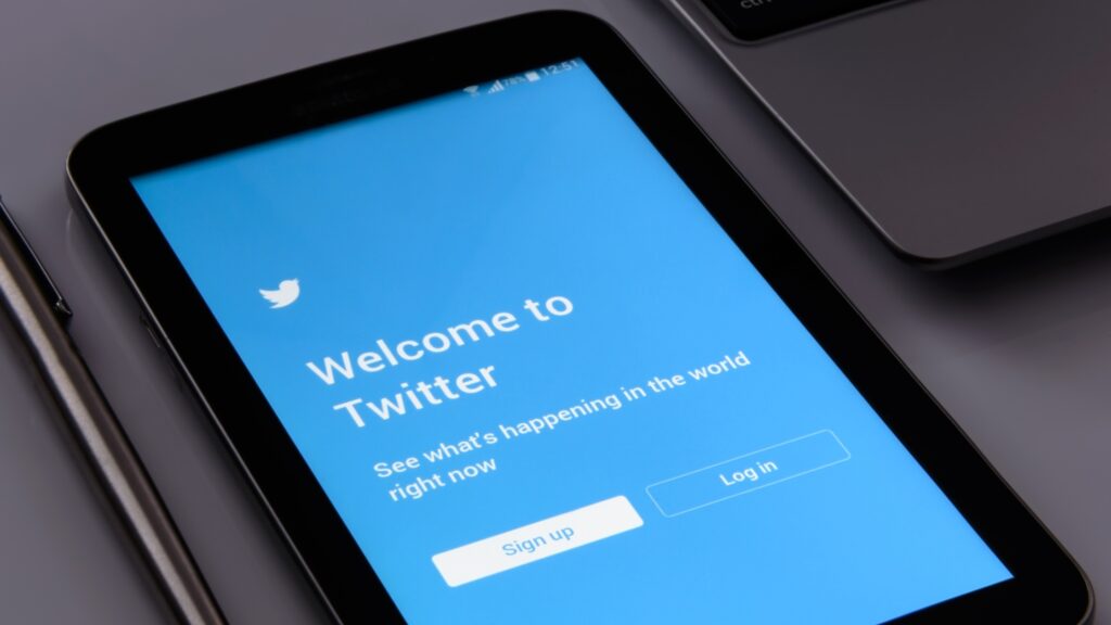
Brands like Facebook, Twitter, and Skype use blue in their logos and websites to convey a sense of reliability and trustworthiness.
#2 Orange
Orange is a highly energetic and vibrant color that conveys a sense of excitement and enthusiasm. It is often used in marketing to grab the audience’s attention and draw their focus toward a particular product or service.
If you want your audience to get excited, choose the orange, also considered an impulse-buying color that stimulates physical activity and purchase behavior.
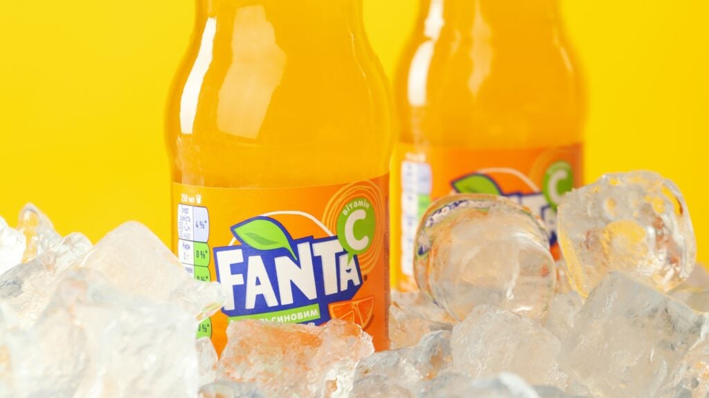
However, too much orange ushers in the opposite effect. The best way to use orange is to use it on some section of your site or the landing page. Brands like Fanta, Nickelodeon, and Amazon use orange in their logos and advertisements to create a sense of fun and excitement.
#3 Yellow
Yellow is a cheerful and sunny color associated with happiness and optimism. It is often used in marketing to evoke feelings of positivity and optimism in the audience. This color is also associated with the sun and smiley faces; that’s why it represents a happy and youthful color.

Brands like McDonald’s, Subway, and Best Buy use yellow in their logos and advertisements to create a bright and cheerful image.
#4 Green
Green is a color that is associated with nature and growth. It is often used in marketing to convey a sense of health and wellness and is often used in advertisements for products related to health and wellness.

The color green is part of the cool colors paired with violet and blue. It also gives an impression of top-quality products and conveys freshness and natural and organic produce. Hence, it’s a good representation of the environment and our natural outdoor products.
Brands like Whole Foods, Starbucks, and John Deere use green in their logos and advertisements to convey a sense of health and growth.
#5 Red
Red is a highly energetic and attention-grabbing color associated with urgency and passion. It is often used in marketing to evoke feelings of urgency and to encourage the audience to take action.

Since it’s associated with love and war, it has different meanings. However, the underlying message is showcasing important information that improves conversions.
Red is also striking, bold, captivating, and one of the most dominant colors. Brands like Coca-Cola, Netflix, and YouTube use red in their logos and advertisements to create a sense of urgency and to encourage their audience to take action.
Final Words
The psychology of colors plays a significant role in driving conversions. Marketers should carefully consider the meaning behind colors and how they can be leveraged to drive conversions.
By understanding the associations and emotions that different colors evoke, marketers can create a more appealing and effective website, reinforce their brand message, and evoke the desired emotions in their target audience.
Whether it’s blue for trust, orange for excitement, yellow for positivity, green for health, or red for urgency, the right use of color can help drive conversions and achieve success in marketing.
