Logos are a brand’s handshake. Do you believe that? We sure do! Logos give the first impression of your brand. And as the saying goes, you never get a second chance at a first impression.
So, if you want to create a logo before opening up a business, you’re already on the right track! Now comes the fun part: deciding what type of logo best suits your brand.
There are two popular types of logos you’ve probably seen a lot; lettermark logo and wordmark logo.
But which one is right for your brand? Let’s dive into these two logo types and explore how AI logo generators, like Logomakerr.ai, can help you make the perfect choice without breaking a sweat—or the bank!
What’s the difference between a wordmark logo and lettermark logo?
Before we get into the pros and cons of each, let’s make sure we know what we’re talking about:
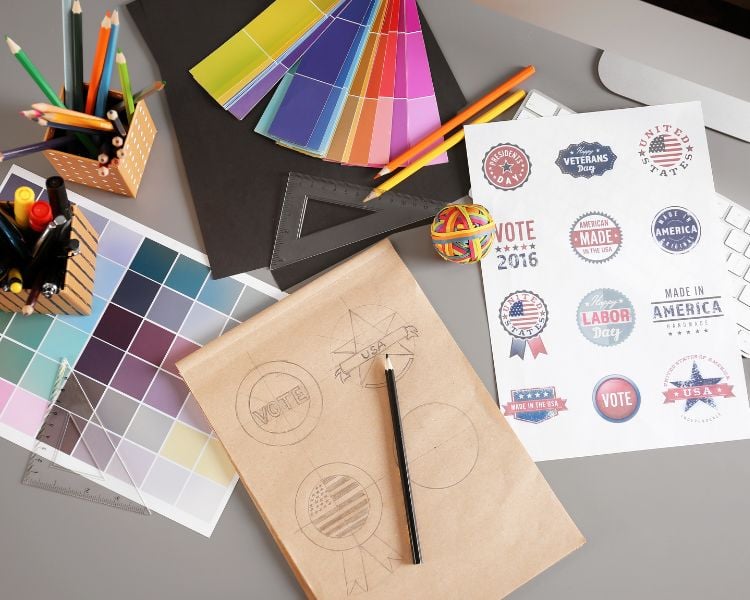
- Lettermark Logos: Also known as monogram logos, these are made up of a brand’s initials. Think of famous brands like HBO, NASA, or IBM. They’re simple, clean, and focus on the key letters of your brand name.
- Wordmark Logos: These use the entire name of the company. Google, Coca-Cola, and FedEx are prime examples. This type focuses on typography and is great for brands with unique or catchy names.
Why wordmark and lettermark logos are trending now?
In a world where minimalism is the trend, lettermark and wordmark logos are having a big moment.
Simplicity is key—many brands are shifting away from overly complicated designs and are opting for clear, straightforward logos that are easy to recognize and remember.
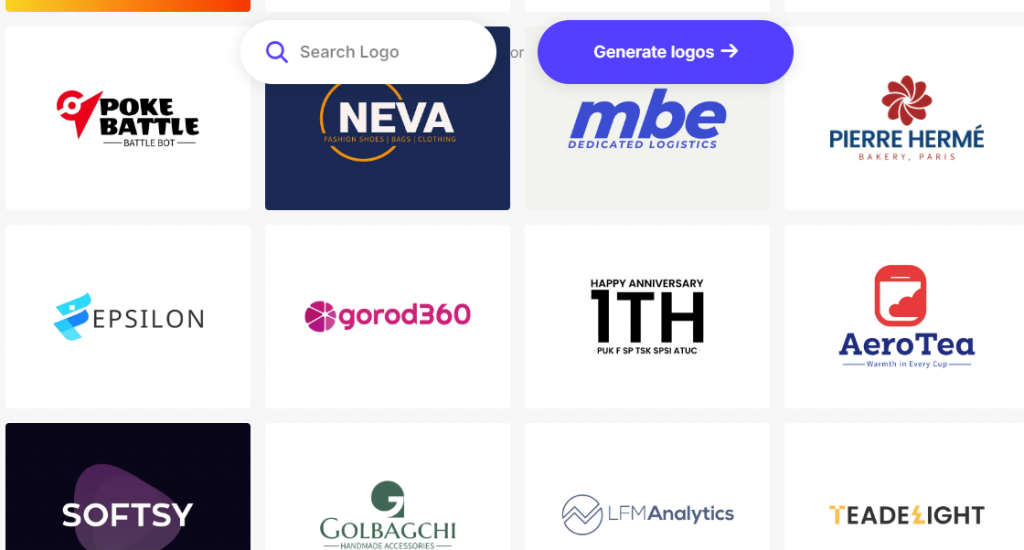
A survey found that 95% of the top brands use only one or two colors and a simple design. It’s no wonder lettermark and wordmark logos are so popular—they fit right into this trend!
The Perks of Lettermark Logos
So, what’s so great about lettermark logos? Here are some reasons why they might be the best fit for your brand:
- Simplicity: Lettermark logos strip your brand down to its core. Using just initials can make a brand look sleek and modern, perfect for companies that want to appear professional and timeless.
- Memorability: Short and sweet works wonders. When people see those initials, they start associating them with your brand’s identity. Think of NASA—their logo is simple, but it’s unforgettable. Read our analysis of NASA logo on this blog.
- Flexibility: These logos are super adaptable. Because they’re compact, they fit just about anywhere—on business cards, social media profiles, merchandise, you name it. They also scale well, so whether your logo is on a billboard or a mobile app, it’ll look just as good.
What’s our take on Lettermark logos?
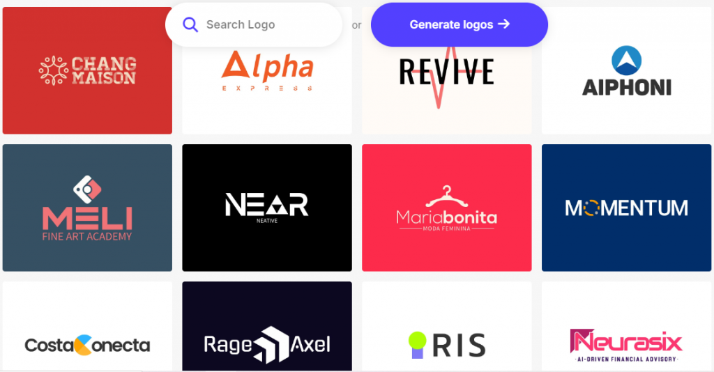
A lettermark logo is great if your brand name is long or if you want a professional, minimalistic look. However, they rely heavily on brand recognition. If people aren’t familiar with your business, they might not know what those initials stand for.
The Perks of Wordmark Logos?
Now, onto the wordmark logos—where your entire brand name is front and center. Here’s why they’re a hit:

- Clarity: Wordmark logos are straightforward. There’s no guessing game involved—people immediately know your brand name, which can be especially useful if you’re new to the market or have a catchy name you want people to remember.
- Personality: With wordmark logos, you can play around with typography to give your brand a unique flair. Think of how Coca-Cola’s script logo gives off a classic, nostalgic vibe, or how Google’s simple, colorful logo feels approachable and friendly.
- Versatility in Styles: Wordmark logos give you the freedom to choose a style that matches your brand’s identity. Whether it’s modern, playful, vintage, or luxurious, you can create a wordmark logo that reflects your brand’s personality perfectly.
What’s our take on Wordmark logos?
Wordmark logos work best if your brand name is short and memorable. However, if your brand name is on the longer side, a wordmark logo might feel too busy or hard to fit into small spaces.
Which logo type is more popular?
According to recent studies, around 37% of the most successful brands use lettermark logos, while 60% go for wordmark logos. The remaining percentage belongs to other logo types like icon or emblem logos. This shows that while both are popular, wordmark logos have a slight edge—likely because they offer immediate brand name recognition.
How to choose the right type of logo for your brand?
So, how do you choose between a lettermark and a wordmark logo? Here are some quick tips to help you decide:
- If your brand has a long name or a name that doesn’t easily fit into a catchy or visually appealing format, a lettermark logo might be the way to go. This will keep things simple and clean.
- If your brand has a short, memorable name, or if you want your audience to quickly associate the name with your product or service, a wordmark logo will work well.
- Consider your brand’s personality. Is it professional and sleek, or is it fun and approachable? This can also help you determine whether to focus on a straightforward wordmark or a minimalist lettermark logo.
Logomakerr.ai for your Lettermark logo!
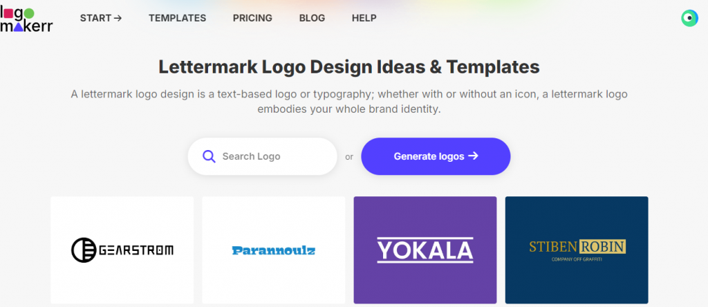
Ready to give your brand the logo it deserves? Let’s go through a simple step-by-step guide to creating your lettermark logo using Logomakerr.ai.
Step 1: Visit Logomakerr.ai
Head over to Logomakerr.ai and get started right on their homepage. You don’t need to download anything—everything is online.
Step 2: Enter Your Brand Name
Input your brand name and choose the initials you want to use. This AI logo generator tool will generate multiple options that focus on these letters, ensuring your logo is concise and impactful.
Step 3: Select Your Industry
Choose the industry you’re in—whether it’s tech, retail, beauty, or anything else. Logomakerr.ai uses this information to provide relevant icons, fonts, and themes that fit your brand’s identity.
الخطوة 4: تخصيص شعارك
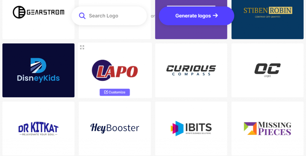
The AI will present you with multiple logo options. Pick one you like and start customizing. You can change colors, fonts, and layouts to match your brand’s personality. For example:
- If you’re going for a professional look, opt for clean fonts and neutral colors like black, navy, or gray.
- For a modern, playful vibe, choose bright colors and bold typography.
Step 5: Preview and Download
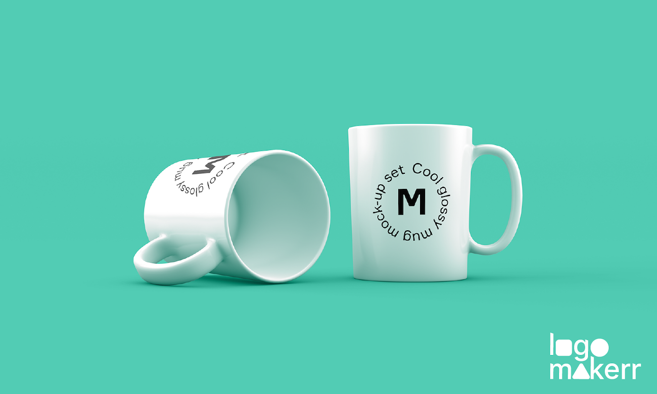
Before finalizing, preview your logo on different mockups—like business cards, websites, or merchandise. Once you’re happy with it, download it in the format you need (PNG, JPEG, or vector).
Final Thoughts
Choosing the right logo is an essential part of building a memorable brand. Whether you go for a lettermark or wordmark, using an AI logo maker like Logomakerr.ai simplifies the process and ensures you get a logo that truly represents your brand.
So why wait? Dive into the world of AI logo design and let your brand’s logo speak volumes!
